We’re very happy to announce the inclusion of FOUR Michelle Turner wedding designs in Album Builder. Michelle Turner, author of the Wedding Photographer Field Guide, is known for her fun, colorful style. During the year, you’ll find her in a tropical location just as often as you’ll find her at home. Her albums are filled with color, fun and love. Here we’ll look at a few of her wonderful designs.
[break]
Concepts in Design
[break]
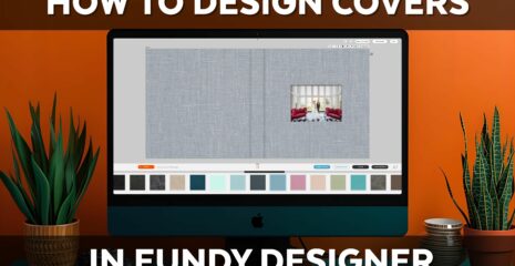
In this post, we’ll talk about a few easy concepts in album design. These aren’t ‘technical’ design terms, these are just lay terms, that are easy to remember and easy to implement.
[break]
Color
[break]
 [break]
One of the most powerful tools at our disposal is color. Color can have an incredible impact on design. On the right side, we see that Michelle was on her game, capturing a multitude of detail shots with red as the primary or accent color. In the design she decided to pair these red themed photos with the blue panoramic shot of the ocean and blue sky. In this design she chose to use the Super Ninja Layout module with “Main Image Left” and a “Collage” of 2 horizontals and two verticals.
[break]
Double Spread
[break]

[break]
At least once, and probably twice in a longer album, you should include a full page spread. It’s a great way to create drama in an album. And, simply put, a beautiful double page spread is just simply stunning. This design was made with a Quick One Up in Ninja Layout.
[break]
Balance
 Designs should have balance. If you have four strong images, then the design should be balanced. Simply displaying the images in a balanced fashion across the spread brings attention to the images equally. One mistake you never want to make is having your design overshadow your imagery. In this design Michelle used Grid Maker and simply chose 4 across and 1 down.
[break]
Accents with Color Bars
[break]

On the left page, Michelle put together a wonderful grid of images with purple being the dominant accent color. Then on the right side, the light or teal blue is the dominant accent color. Contrary to the spread above where the red and blue complemented each other directly, the purple and teal don’t directly work with each other. Michelle then used a nice, simple accent color bar to bring the two pages together into one cohesive design. Michelle used Grid Maker on the left with 2 across and 3 down. On the right, she used Row Maker with one row of 2 verticals. For the color bar, she simply used the Rectangle Tool (U) in Photoshop.
[break]
Echoes
[break]
 [break]
When using the same tones and the same location as a background, I like to call this echoing. Each image echoes the other, creating a rippling effect in the design. Here Michelle used Super Ninja with one full bleed and 3 vertical accent images.
[break]
The Collage Technique
[break]
 [break]
When using a variety of verticals and horizontals, a collage is a fantastic way to create a cohesive look. By grouping the verticals and horizontals into a cohesive group, we’re able to create a beautiful design with a relatively large number of images. Michelle did a quick one up on the left. Then on the right she used Column Maker and Row Maker. On the top she did a ROW of three verticals. Then she did a column of 2 horizontals, 2 horizontals and then one vertical.
[break]
I hope you’ve enjoyed these tips and tricks with designs. We’re very proud to announce the inclusion of four, full Michelle Turner wedding albums of templates in Album Builder v3.8.[break]
Download the Trial Here
Upgrade to Album Builder v3.8 Here.
[break]