We’ve all heard the saying, “Less is more.” But how does that apply to your album design? Let’s take a look at how this adage has meaning for each album you design.
The typical wedding album is roughly 30 pages and generally, 60-70 images. (We suggest 2-3 images a page on average.) Some pages will include maybe six to 10 images for those details shots and some spreads may include one, landscape image. So, all in all, it evens out.
So, how is “less,” more?
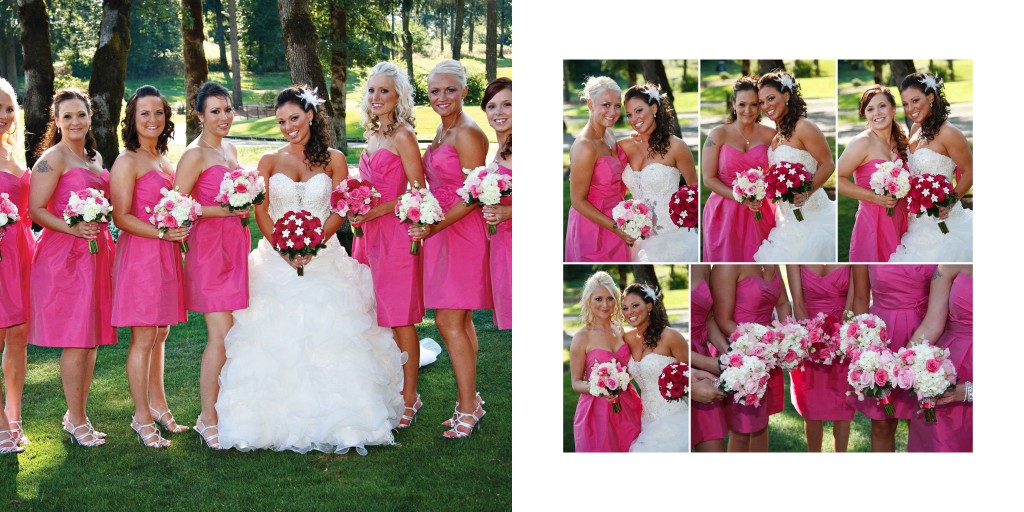
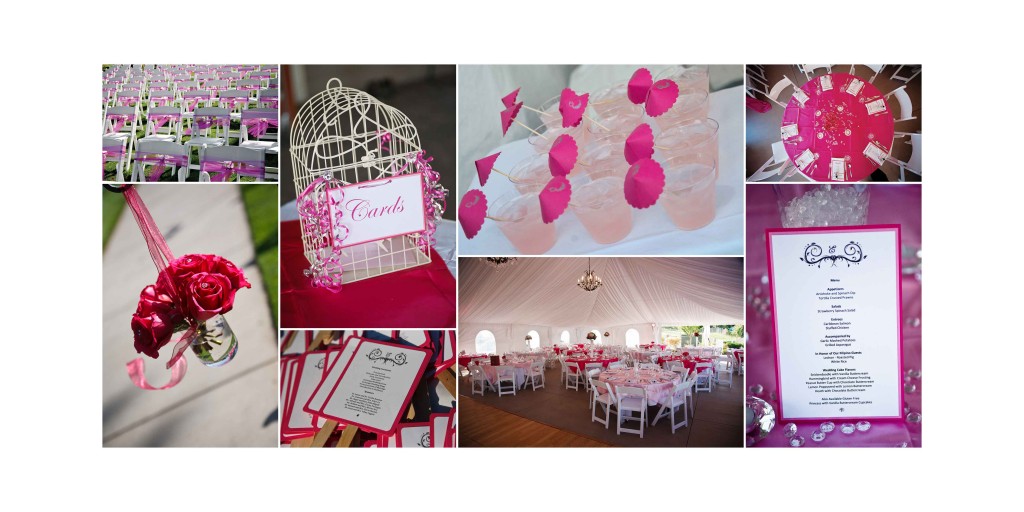
In these before images below, the designs are grid crazy. We all like the Grid Maker feature of Ninja Layout in Album Builder, but spread after spread doesn’t need to include every detail shot from the reception, every family member dancing or every posed portrait of the bridal party.
Before:
After:
These spreads show how less is more. You can still include great images of the couple and family members at the wedding but you don’t need to use every photo you took. You don’t want to overwhelm the eye by including spread after spread of tiny images in grids. Don’t forget your accent shots complement main images.

images courtesy of AJ’s Studio


