Creative Uses of the Tone Curve Panel in Lightroom’s Develop Module.
Tone Curves are one of the most powerful tools in Lightroom to creatively infuse your images. But let’s face it, the mere mention of the word curves and photographers’ eyes start glazing over and twitching. But guess what? Learning to master the Tone Curve Panel, even at a basic level will reward you with more creative control in your post production.
What Can You Do With Curves?
The Tone Curve Panel is a visual reference of the tonal range in your image (Highlights, Lights, Darks, and Shadows). Curves are a powerful tool giving you the ability to control brightness, contrast, saturation and color in your image. It’s a lot like magic without the wand.
At first glance, you’ll notice a diagonal line in the Tone Curve Panel. Along the bottom are all the brightness values in your image, ranging from pure black (on the left) to pure white (on the right). If you grab a point along that line and start to bend the line upward into a curve, you brighten the tones at that point. This is why it’s called a tone curve!
Ready to Start?
If you’re new to curves, it’s easy to jump in. When you first open the Tone Curve Panel, you’re presented with the Basic or Parametric Curve. It’s a straight curve with four triangle sliders underneath it. These sliders (Highlights, Lights, Darks, Shadows) represent tones in 25% increments from black to white. There is also a faint histogram showing you the distribution of pixels from black to white. As you move your mouse across the window, you’ll notice three things happen.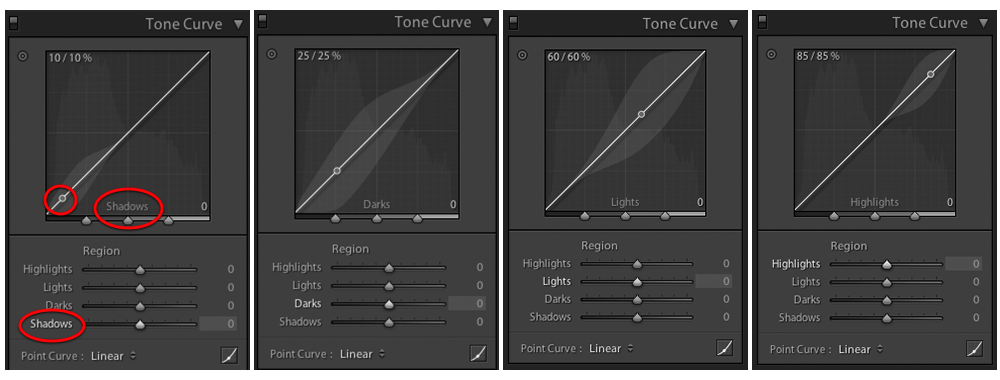
- The cursor changes into a horizontal bar indicating you can move it up and down and a corresponding point on the curves line.
- A readout in the upper left shows you the tonal value as a percentage. 0%=black and 100%=white, that changes as you move across the window.
- The tonal range appears at the bottom of the Tone Curve window and the corresponding triangle slider is highlighted.
To make changes, you can either move the triangle sliders or grab a point on the curve and move it up/down. Your adjustments are smoothed out to help prevent posterization and banding. There’s even a toggle box to see a before/after located at the top left of the panel.
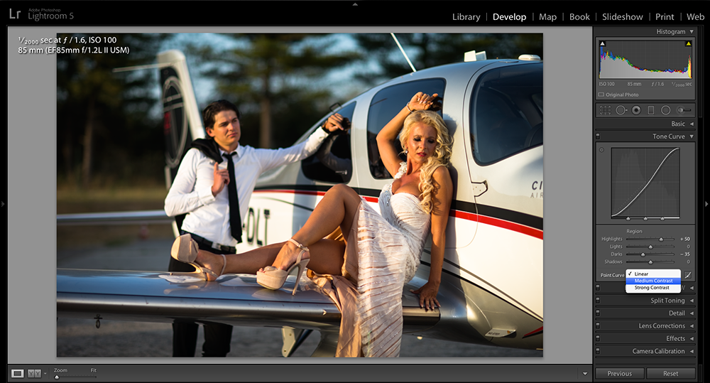
Want to add contrast? Create an “S” curve! This is easily done by moving the Highlights slider to the right and the Darks slider to the left. Lightroom even has preset curves (Linear, Medium Contrast, Strong Contrast) which you’ll find in the lower left corner of the panel.
No Fear! It’s Easy to Start Over!
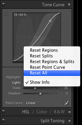
Don’t be afraid to play and learn. If you wander too far out of your comfort zone, it’s easy to reset the Tones Curve Panel. Simply right-click in the window and choose Reset All from the contextual menu. It’s as if it never happened!
The Power of Tats and We’re Not Talking Tattoos!
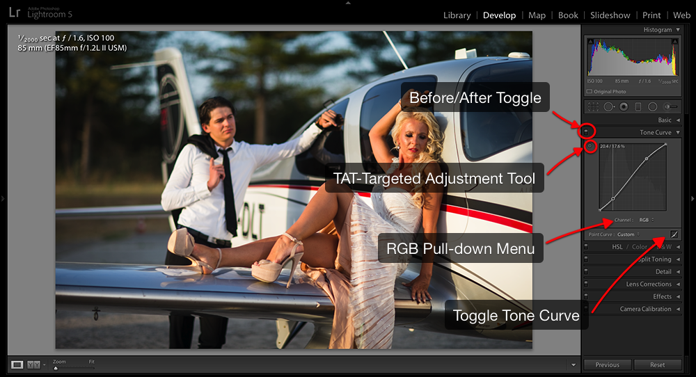
If you’re more of a visual person, you’re going to love TAT (Targeted Adjustment Tool). Click the TAT icon as you move the TAT cursor over your image, you’ll notice a reference point on the curve. When you Click + Drag up/down in your image, Lightroom will automatically detect and increase/decrease the tonal value you’re targeting with the tool. To deselect the TAT, simply hit Escape or click the TAT icon in the Tone Curve Panel.
I Want It All! Give Me the Power!
To really unleash the creative power of Tone Curves, you need to change to Point Curves. To toggle to this mode, click the icon in the lower right corner of the Tone Curve Panel. The triangle sliders will collapse and you’ll see Channel: RGB with a pull-down menu (RGB, Red, Green, Blue). You can adjust the entire image (RGB) or target a specific color channel. This is where the magic of curves happens!
Just like Photoshop curves, you can place points on the curve and make adjustments. You also can target a specific part of your image by grabbing the TAT and clicking on your image. You’ll notice that a point is automatically placed on the curve for you!
To delete a point on the curve, simply grab the point and drag it outside the grid. You’ll see the curve snap back as you pull the point off the curve. You can also right-click the point and choose Delete Control Point from the contextual menu. If you choose Flatten Curve from the contextual menu, all your points will be cleared.
By choosing the RED channel from the drop-down menu, you can add red to your image by placing a point and dragging it up. Dragging it down will add the opposite color (cyan) to your image. In the GREEN channel, you can add green or magenta and in the BLUE channel, you can add blue or yellow. Total creative control all from curves!
Blah, Blah, Blah… Let’s Do This!
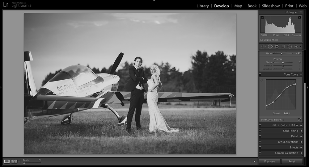
Now that you understand the basics, let’s try a few creative enhancements using Tone Curves. A popular technique is to pull up the shadows and pull down the highlights, flattening out the contrast to emulate the look of film. It’s easy to do with Tone Curves. Much like seasoning your favorite recipe, how far you go is a matter of taste.
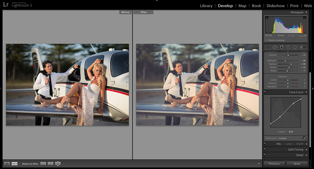
It always helps to start with an incredible image like this one provided by Marko at Spinaker Graphics in Croatia. By taking the black point and pushing it up and taking the white point and pushing it down, you can immediately see how the contrast is lowered. By adding two more points and creating a subtle “S” curve, contrast is added to the mid-tones.
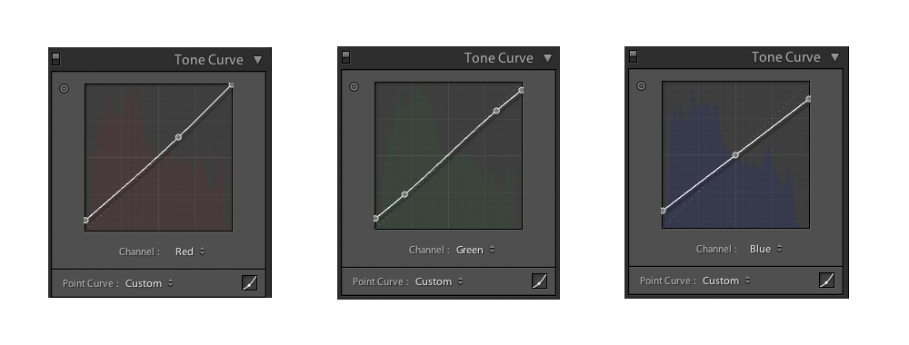
From there, using the pull-down menu for each channel (Red/Green/Blue), you can subjectively change the color saturation and contrast. If you want to add yellow to the highlights, go to the Blue Channel and drag the white point down. By dragging the black point up, you add blue. You can also add a point in the middle so it does not move, keeping the mid-tones neutral. Moving a point up, adds that color. Moving a point down adds the opposite color. Pretty simple, right?
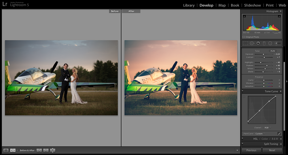
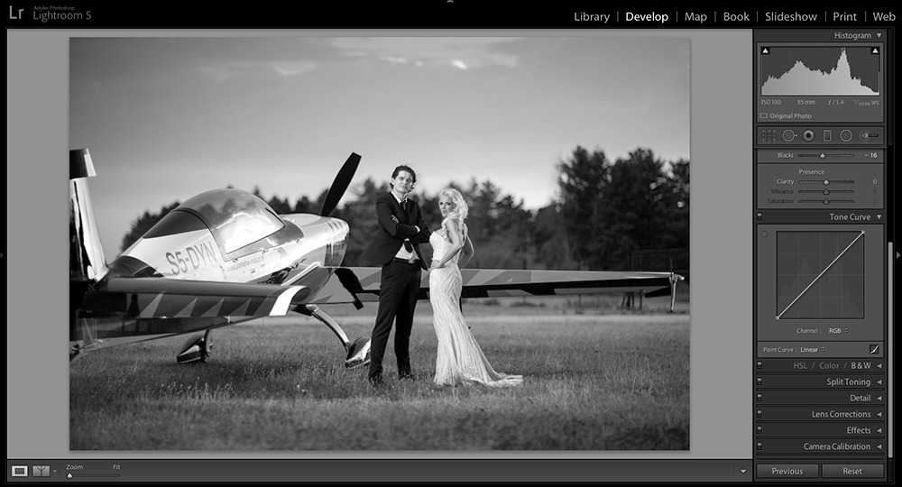
What you decide to do is completely up to you! It’s extremely powerful and nearly limitless in variation. Here’s another wonderful image by Marko at Spinaker Graphics. Straight out of the camera, it stands on its own, but with Tone Curves, you can create another version. 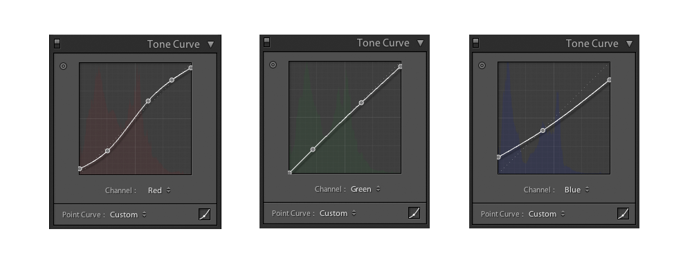
For this example, I wanted to emulate the look of film with a color tint. By going into each channel and creatively playing with different settings, I was able to come up with a nice alternative to this powerful image. And all of this is being done in Lightroom!
But Wait, There’s More!
Tone Curves are also a great way to create variations in your Black and White images. In this example, I took Marko’s image and converted it to Black and White using Lightroom’s B&W panel. Then, using Tone Curves, I brought up the black point and brought down the white point. Threw in an “S” curve to give the mid-tones a little contrast boost.
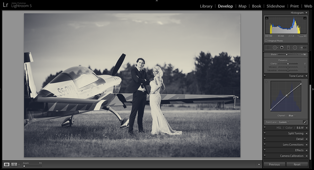
Finally, in the last example, I went one step further. A split-tone technique that is so simple, you’ll wonder why you were ever afraid of the Tone Curve Panel. By going into the Blue Channel, and dragging the white point down, I introduced yellow to the highlights. Then, dragging the black point up, blue was added to the shadows. Adding a point in the middle gives you the ability to control what tones in the middle are kept neutral.
Hopefully, you come away inspired to play with the Tone Curve Panel. The best way to learn is by doing. Once you understand the basics, roll up your sleeves and start playing. The creative possibilities are only limited by your imagination. Push things around and see what happens. Maybe you’ll discover something new!