If there’s a part one, then you know there’s going to be a sequel. And if you’re a fan of the old Hot Shots movie, then you know the sequel has to be part deux. Not one to disappoint, I’m going to share another five of my favorite tips to help you work more efficiently, productively and creatively in Lightroom. So, without further ado, let’s deux this.
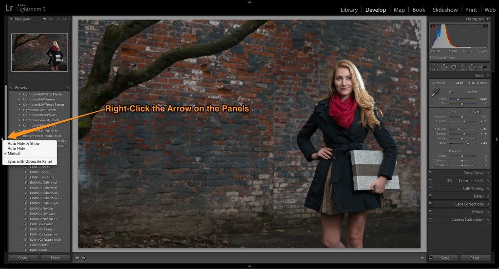
Tip Number 1: Turn off Auto Show panels
Until you know about this tip, your life in the Lightroom’s Develop Module is spent trying to deal with the panels popping in and out, which can be frustrating, annoying and time consuming. Fortunately, there’s an easy way to turn off this feature. Ctrl-Click (Right-Click) the arrow on the center edge of any panel and choose “Manual” from the contextual menu. Now, the panels will only open when you click on the panel’s arrow icon.
© Andrew Funderburg
Bonus tip: Solo Mode
When you Ctrl-Click (Right-Click) on any dark gray area in the left or right panel, a pop-up menu appears with the option for Solo Mode. This keeps only one panel open at a time. When you open another panel, the one you were working in automatically collapses. Saves a lot of scrolling time, tames those panels and makes it easier to locate the settings you’re trying to find. Keep in mind that you’ll need to set this for the panels on the left and right side. It’s also specific to the module you’re working in.
Tip Number 2: Store photos inside one main location
Everyone has their own way of working and while each person’s way is valid, if you want to keep peace, love and understanding within Lightroom, you won’t import photos from all over the place. Choose one main location. A folder, such as Pictures (My Pictures) and put all your images inside that folder. You can have as many sub-folders as you want inside your one main folder.
Personally, I use a separate hard drive that is dedicated to client/personal files. This works really well for laptop users as you don’t need to keep everything on your laptop. The bonus of this approach is that it’s super easy to back up your image library and your Lightroom experience will be much smoother and hassle free.
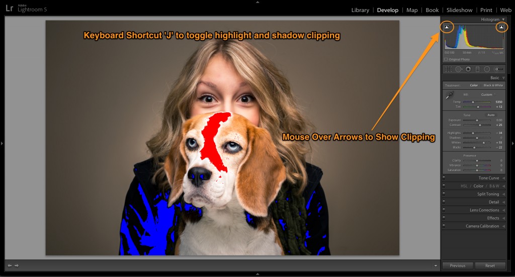
Tip Number 3: Quickly seeing clipped shadows and highlights
Clipping is a penalty in football and while you can get away with it in Lightroom, no one likes it much there either. When visually making adjustments in Lightroom, it’s extremely useful to see what values in your image are being lost (clipped). There are a number of ways to do this quickly and easily.
To quickly see what is being clipped in your image, click “J” to toggle the clipping warnings. Clipped highlights will show as red and shadows as blue. You can also hover over the arrows in the left and right side of the histogram. If you Right-click the arrows in the histogram, options appear in a drop-down menu to customize how this works. Once the clipping indicators are active, you can easily make adjustments to your image with immediate feedback to bring those values back in line. The clipping indicators in the histogram show clipping in both luminosity and channels, with the color changing to indicate which channel is clipping.
© Randy Kepple Photographs
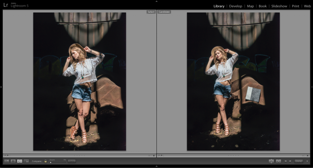
Tip Number 4: Comparing photos
One of the hardest tasks when editing a set of images, is figuring out which ones are your best. Especially if there are a sequence of images that are nearly identical. What you need is a tool to compare your top picks side by side so you can pick the best. Fortunately, Lightroom provides an easy way to to do this.
To compare two photos side by side, click the “C” key. Start in the thumbnail view and select a set of images you want to compare. The first one you pick is called the “Select” and will have a lighter frame around it. The next image, displayed to the right in select mode is called the “Candidate.” If you selected more than two images, use the left and right arrow keys on your keyboard. Lightroom cycles through the selection displaying each image as a Candidate.
There are a set of icons along the bottom of the Compare View that helps you narrow down your selection to your favorite. There are icons to flag the image as a Pick or Reject. You can also click on the dots to give your photos a star rating, click on the grey square to apply a color label or X to deselect a photo and remove it from Compare View. If the photo changes when you apply any rating features, it’s probably because you have Auto Advance turned on. You can toggle this on/off under the menu: Photo>Auto Advance. I recommend turning it off.

© Andrew Funderburg
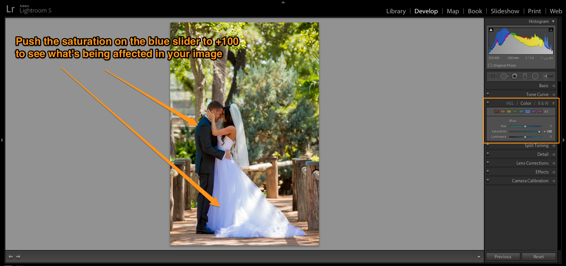
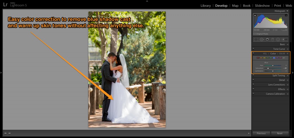
Tip Number 5: Dealing with the open shade blues
This is one of my personal favorite Lightroom tips. I use this a lot with weddings, but it’s come in handy for a lot of other situations. You know the story, it’s a familiar one to any wedding photographer. Especially if you’re a natural light shooter. You can color correct your image to perfection and for whatever reason (breaking the laws of science), the bride’s dress will have a blue color cast. Wouldn’t it be great if there was a way to quickly remove that blue color cast without screwing up your finely honed, color corrected image? Well, there just happens to be a way.
In the Develop module, head down to the HSL/Color/B&W panel. Click on Color and select the blue square to target that color value in your image. At this point, what I like to do is grab the saturation slider and crank it all the way up to 100 percent to quickly see what’s going to be affected in my image. In this example, it was exactly what I was hoping. The blue color cast in the brides’s dress and a little bit on the grooms jacket.
© Randy Kepple Photographs
Next, you simply slide the saturation slider down to desaturate the blue color cast. It’s an easy way to quickly and easily target a specific color cast without touching anything else in your photo. It usually makes skin tones better, too, even if you were using fill flash. If you have blue skies in your image, this won’t work (as it will desaturate your blue skies) and you’ll have to use another method, such as the adjustment brush.
 © Randy Kepple Photographs
This is also a great way to add drama to an image that features a lot of sky and clouds. The Ansel Adams effect is what I call it. Like using a red filter with black and white film to dramatically darken blue skies and make clouds white and vivid. With the blue channel selected, you can increase saturation to add more blue to your skies and then decrease the luminance slider to make that value darker. This will deepen your blue skies and add more contrast to the clouds without affecting the other values in your photo.
Bonus Tips: Because prequels don’t work with Lightroom articles
These tips are just too good not to mention. Do with them what you will, but know that knowledge is power. Use at your own risk:
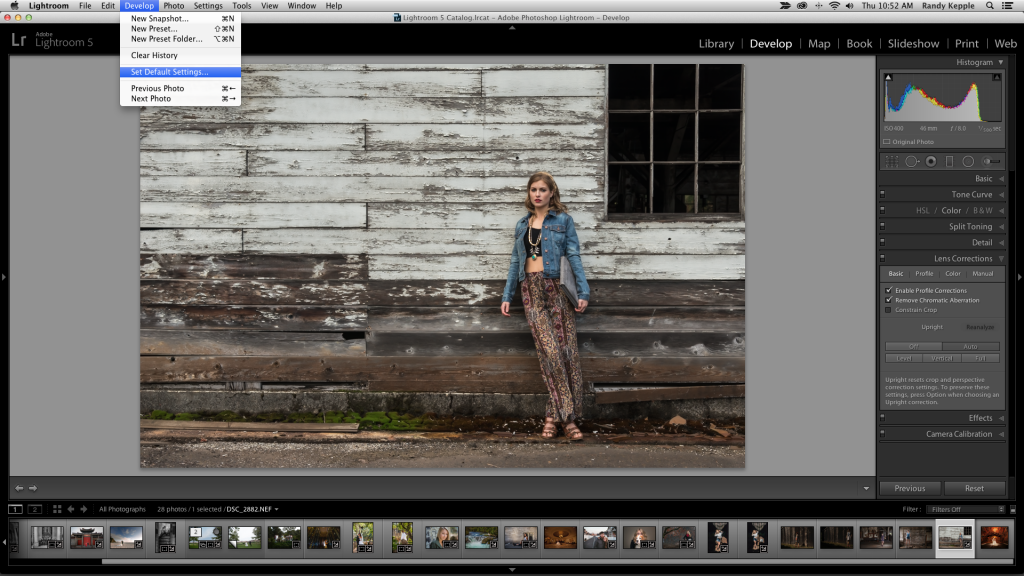
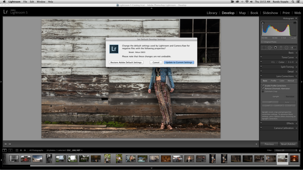
- This is also one of my favorite tips. By default, Lightroom presets all the develop sliders. Depending on how you shoot, this may not work for your images. It certainly doesn’t for mine. After continually moving the sliders, or copying the settings from one image to the next, I discovered that I could save my own custom settings as a default setting. Here’s the beauty of this tip. Now, when I import my photos, my custom default settings are applied from the start and I’m much closer to my final image with less effort. The bonus is that you can do this for different camera bodies. Lightroom will recognize this and apply the custom default settings for each body automatically. Great if you shoot with more than one camera body or work with other shooters.
© Andrew Funderburg
© Andrew Funderburg
- How do I know if I’ve gone too far? When you’re working in the Develop Module, click “” to quickly view the original image before you started down the path of crazy adjustments. Click it again to return to your final version. Which one’s better? Only you can decide.
- Easily distracted? Are all those panels and menus and options taking your focus off of what really matters? Your image? Click “L” to dim everything around your image and one more time to make them black. An easy way to remove distractions when making a final evaluation of your image.
- When is one click not enough? When trying to change your white balance. Chasing white balance in Lightroom can be exhausting. Fortunately, clicking “W” will bring up the white balance eyedropper and you can rinse and repeat this to your heart’s content.
- Shortcuts? Why does everyone seem to know the secret handshake but me? All you have to do is click Command (Ctrl)+/ and you’ll see all the shortcuts for the module you’re in. Welcome to the club.
The digital darkroom. It’s supposed to save us time. Work smarter, not harder. Using these tips, you’ll be more efficient, productive and creative. I hope you find these tips helpful and they give you more time to follow your dreams.