Today’s tip of the week is all about design. One of the easiest concepts to implement into your own designs is balance: balance of tone and balance of design. Today we’ll look at some very simple examples of how to balance your design.
Balance of Tone
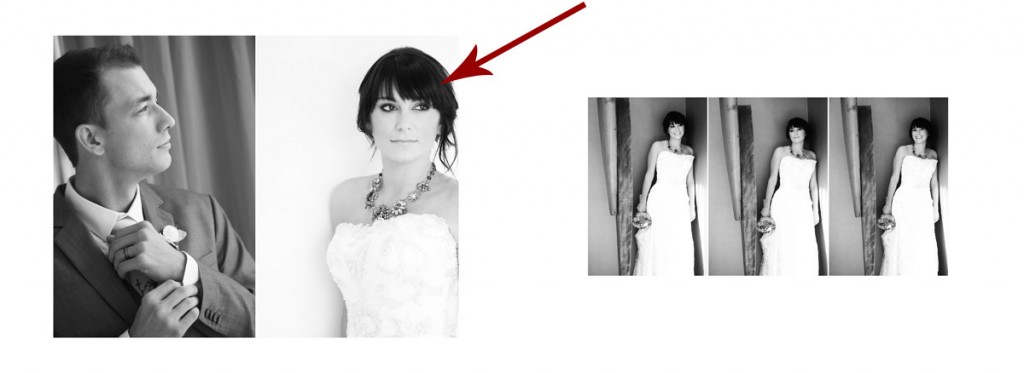
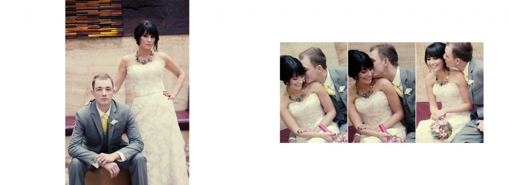
As you can see in this design, the bridal portrait with the red arrow was shot front lit, but all of the other photos were shot side lit. So the tone of the images are very different. The front-lit portrait is very high key, light toned, while the other portraits are quite low key with dark tones. This tonal difference results in a contrast that doesn’t work.
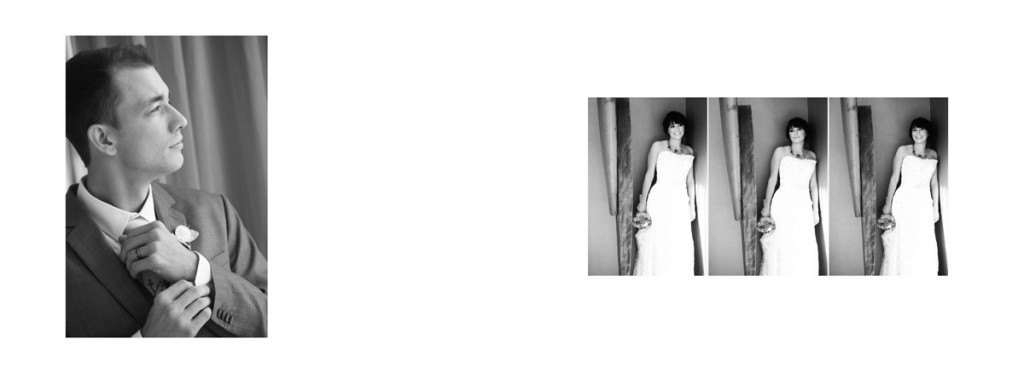
Notice, that when we take out the photo in question, the tone of the design is much more cohesive, resulting in a better design.
Balance of Design
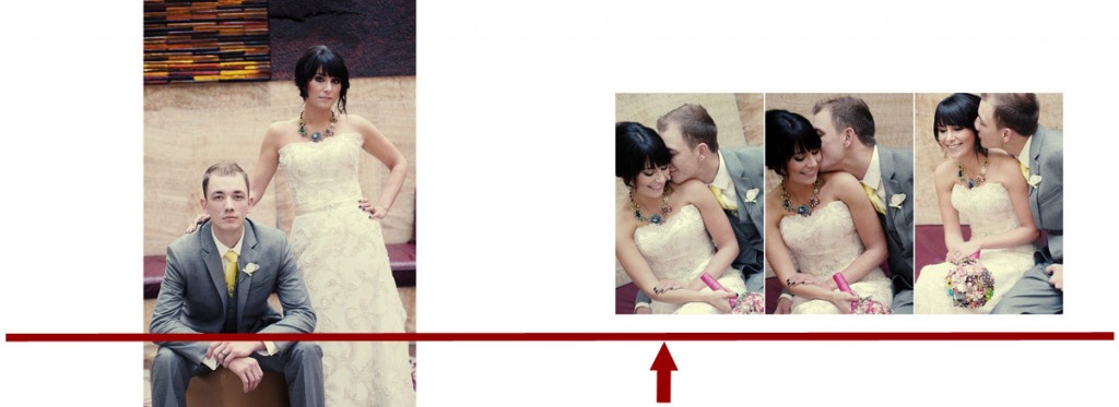
In the design above, I have placed a straight line and also an arrow to represent a See Saw and Fulcrum. If we take the weight of the large image on the left and the three images on the right, the weight seems off center. I’ve placed the arrow at where I feel the weight of the images would balance out.
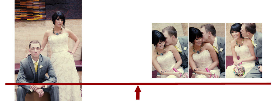
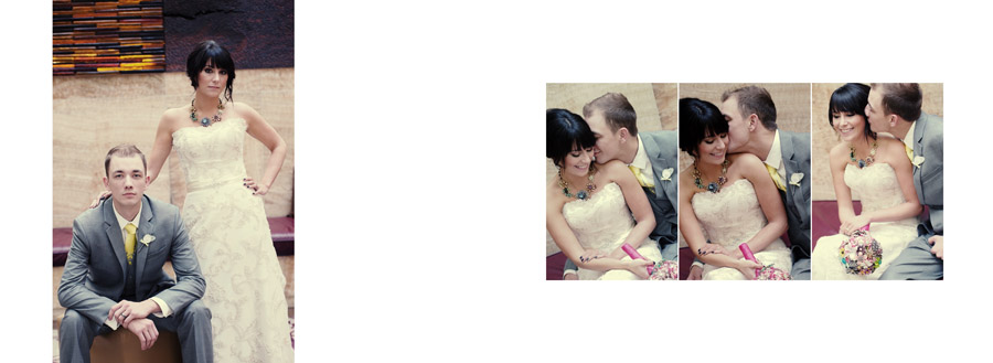
If we move the large image more to the left, the balance of the design shifts with it and it appears to the eye that the design is balanced, with the center “weight” being in the center.
Before
After
We hope these tips help you design better, increase album sales and just have more fun!
All designs created with Album Builder, all images copyright Andrew Funderburg and Fundy Software INC.

